

People often complain—and rightly so—that the typical exercise science study involves a half-dozen male undergraduates who follow some sort of workout routine for a couple of weeks. So you can imagine the enthusiasm that greeted a recent BMJ Medicine study that followed 70,000 women and 40,000 men for over three decades, looking for links between the various types of physical activities they engaged in and how long they lived. Finally, definitive answers to our questions!
The study was very widely covered in the media and extensively discussed on social media. The main message, as highlighted in the accompanying press release from Harvard, where the researchers are based, is that doing a variety of different types of exercise is healthier than doing just one thing, regardless of how much you do. But commenters were also fascinated by a series of colorful graphs plotting dose-response curves for individual types of exercise, purporting to show that walking is the best, jogging is good but not too much, swimming is no good at all, and so on. And more generally, the results even hint that beyond a relatively modest amount of weekly exercise, doing more of anything doesn’t help you.
It’s worth taking a closer look at these results (the paper is free to read online), because they convey some important lessons about what exercise does for us, what it doesn’t do, and why even massive, long-running studies can lead us astray if we don’t interpret them carefully. I’ll take a look at three key claims: that too much exercise is bad; that certain types of exercise are uniquely bad; and that doing a variety of exercises is best.
Is Too Much Exercise Bad?
First, some background: the data in the new paper comes from two well-known cohorts: the Nurses’ Health Study and the Health Professionals Follow-Up Study. Participants periodically filled in questionnaires reporting how much time in a given week they spent doing various activities such as walking, running, cycling, swimming, playing tennis, or lifting weights. That’s the only data the researchers had on physical activity: no details on whether you’re spending that time, say, dog-paddling in the shallow end with your toddler or swimming across lakes at top speed.
The most basic finding is that exercise reduced the risk of premature death. In the graph below, the most important line is “all cause mortality,” which expresses your overall risk of premature death compared to someone who doesn’t exercise at all, as a function of how much you exercise:
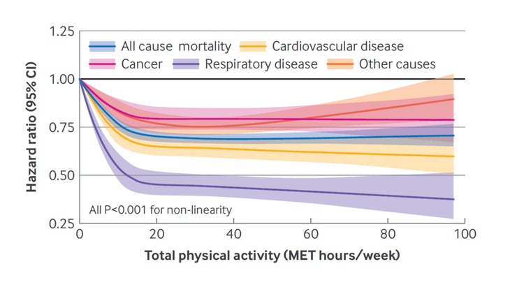
That all-case mortality line drops sharply and then plateaus at roughly 0.7—that’s a 30 percent reduction in risk—beyond about 20 MET-hours per week of exercise.
Note that this is not hours per week of exercise. A “metabolic equivalent of task,” or MET, is a measure of how hard exercise is relative to how much energy you burn when you’re just lying on the sofa. For example, they estimate that walking takes 3 METs (triple your resting metabolism), so walking for 2 hours would burn 6 MET-hours of energy. That means 20 MET-hours a week is just under an hour a day of walking. Running, on the other hand, is assumed to take 12 METs, so 20 MET-hours is 100 minutes of running per week.
So the big question here is: Is it pointless to do more than 20 MET-hours per week? Various versions of this question have been debated for the last decade or so. One answer: if you enjoy it, knock yourself out. There’s no evidence here that higher levels of exercise are actually bad for you. And intuitively, it makes sense that you eventually reach a point of diminishing returns from exercise.
Personally, though, I’m not convinced that 20 MET-hours per week is a genuine threshold. There are a lot of potential issues with this sort of epidemiological study, where scientists can only observe without asking people to change their behavior. The most important one is the risk of confounding variables: people who exercise a lot tend to be different from people who don’t exercise a lot, and some of those factors—socioeconomic status, smoking, nutrition, and so on—will affect how long people live.
To combat this problem, statisticians “adjust” the results to effectively make it seem as though the subjects were identical in every respect except how much they exercise. For example, in this study, they adjusted the results to equalize diet healthiness based on a score called the Modified Alternative Healthy Eating Index. They have to do this because the most active subjects had a significantly higher diet score than the least active subjects, and we don’t want to mistakenly attribute the longevity benefits of their healthy eating to exercise.
But they also adjust other factors such as BMI, blood pressure, and cholesterol levels. And here we run into a problem of circularity. Exercise lowers BMI, blood pressure, and cholesterol levels, so it’s not surprising that the most active subjects have lower scores in all these categories. But statistically equalizing these parameters effectively erases some of the benefits of exercise! If it appears that exercise has no longevity benefits beyond 20 MET-hours per week, that’s in part because we’re leaving out any beneficial effects of lowering BMI, blood pressure, and cholesterol.
(Side note: yes, many people would argue that exercise doesn’t lower BMI. Let’s leave that argument for another day. I will merely note that the average BMIs in this study, by quintile from least to most active, are 26.4, 25.5, 25.0, 24.5, and 23.9.)
What difference does this statistical adjustment make? Here’s what the relative risk of premature death looks like for five roughly equal groups divided up based on how much physical activity they reported. The “adjusted” data corrects for ethnicity, family history of heart disease or cancer, BMI, smoking status, diet quality, blood pressure, cholesterol, and various other factors:
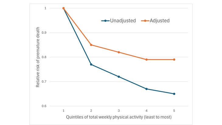
In the adjusted data, the benefits of exercise seem to plateau for the fourth and fifth quintiles. In the unadjusted data, on the other hand, the benefits continue to increase. The gap between the two lines reflects, in part, the degree to which the adjusted results are underestimating the benefits of exercise. This is why I’m not convinced that the benefits of exercise plateau beyond 20 MET-hours per week.
Are Some Types of Exercise Uniquely Bad?
Lots of previous epidemiological studies have shown that exercise, as a whole, promotes longevity. This one is so big that they have the statistical power to break down the results by individual activities. They share the results for nine of these activities in the following graph:
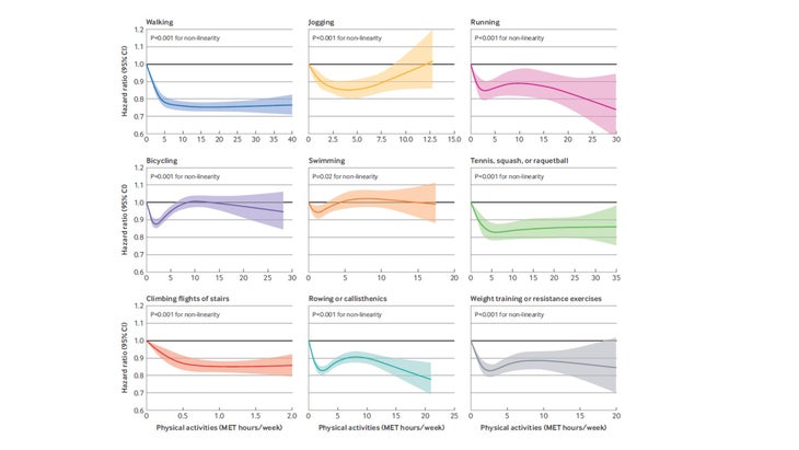
What jumps out is that all the curves are different. Walking produces a big, robust decrease in the risk of premature death (the “hazard ratio”) followed by a plateau. Jogging has a U-shaped curve; running has more of a W shape. Wait, what? “Jogging,” it turns out, is classified as anything slower than ten minutes per mile, while “running” is faster than that. This is our first warning sign that something is amiss, since ten-minute miles are a very different form of exercise for a fit 30-year-old and a mostly sedentary 80-year-old. Still, it’s odd that the curves have completely different shapes.
From the researchers’ perspective, the main message here is the unsurprising fact that the curves aren’t straight lines—that is, that the benefits of adding more exercise to your routine depend on how much exercise you’re already doing.
On social media, on the other hand, there’s a lot more commentary on the specific shapes of individual curves. Why, for example, is a little bit of bicycling good, a medium amount bad, and a very large amount good again? You can (and many commenters did) come up with elaborate explanations about how the cardiovascular benefits of cycling interact with the risks of getting sideswiped by a truck to create this odd-shaped curve. But this is clearly nonsense. What we have here is imperfect data fed into complex statistical adjustment algorithms and then chopped into pieces that are too small to yield meaningful insights.
Some of the curves do look reasonable. Walking looks okay (with the caveat, again, that the plateau is probably an artifact of adjusting for things like cholesterol). I like the running curve, which suggests that (counter to earlier claims) more is better up to very high amounts. But that’s not how it works: you can’t just pick the outcomes that make sense to you and assume they’re “correct” while ignoring the other ones. That’s like the famous quote from ancient Greek physician Galen (which I encountered mostly recently in David Epstein’s forthcoming book, Inside the Box): “All who drink of this remedy recover in a short time, except those whom it does not help, who all die.”
Is Variety the Spice of Workout Life?
This brings us to the central message of the study: that doing a variety of different types of physical activity is better for you than an equivalent amount of just one activity. This claim passes the most important hurdle, which is that it makes sense. As the researchers point out, there’s solid evidence that aerobic exercise primarily increases cardiovascular fitness while resistance exercise primarily increases muscular strength. Both strength and cardiovascular fitness have been associated with longevity, so we should assume that variety is good.
To test this claim, the researchers assigned each subject a “variety score,” which basically involved adding up the number of types of exercise they reported doing consistently. The maximum score was 13. The problem, of course, is that people who have a higher variety score probably do more exercise overall—so if they live longer, you can’t tell whether it’s variety or amount that helped. You need to look at both factors at once.
Here’s a graph showing the risk of premature death for three groups (on the horizontal axis) who had low, medium, or high total amounts of physical activity. Within each group, there’s a data point for people who had low, medium, or high exercise variety:
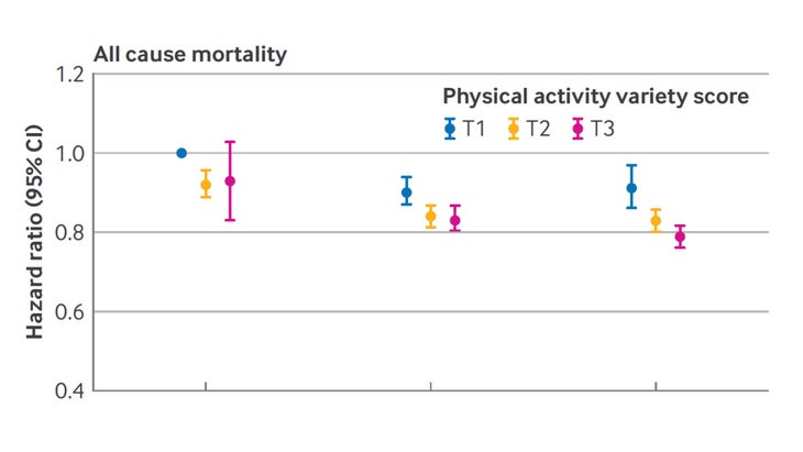
You can see that, within each group, going from low to high variety mostly seems to be helpful. The effect is clearest for the group doing the most overall exercise, which makes intuitive sense. My guess is that this is a real effect, but in addition to the problems with statistical adjustment that I mentioned above, there’s also a risk here of reverse causation: people who are already healthy are the most likely to play a weekly game of pickleball and jog a few a times a week and hit the gym.
So what should we take from this study, or more generally from the large existing body of epidemiology with all its strengths (big numbers and long timeframes) and weaknesses (messy data and lack of randomization)? A useful thought experiment is to imagine your reaction if the results had been reversed. If this study had suggested that even modest amounts of exercise are bad for you, or that exercise variety shortens your life, I simply wouldn’t have believed it. Since that’s the case, I shouldn’t put too much weight on the findings even where they agree with my preconceptions.
Someday, improved wearable accelerometers are going to give us big data sets where we’ll have a much more accurate picture of how and how much people really exercise. Until then, there’s a parallel body of epidemiological research that skips the messy process of asking people to guess how much of each activity they do. It involves objective measures of fitness. Instead of asking “How much do you jog?”, they measure your VO2 max; instead of asking “How much do you lift?”, they measure your grip strength. Both of these parameters predict longer life, with no evidence of negative effects even at the highest level of fitness. If you’re looking to optimize both your lifespan and your healthspan, the advice remains simple: get as fit and as strong as possible, following whatever plan works for you.
For more Sweat Science, sign up for the email newsletter and check out my new book The Explorer’s Gene: Why We Seek Big Challenges, New Flavors, and the Blank Spots on the Map.
The post What the New Study on Exercise and Longevity Really Tells Us appeared first on Outside Online.